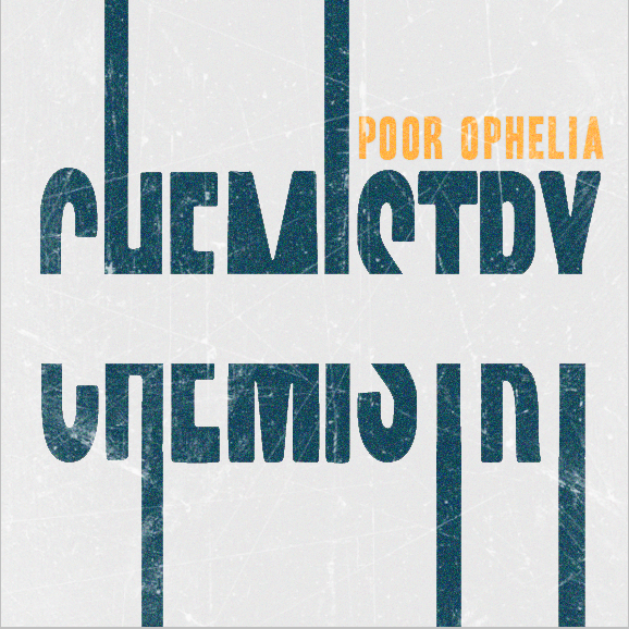
Poor Ophelia CD Cover
This design was created for the local band Poor Ophelia. Because they wanted a design that visually represented the idea of chemistry between two people, I created a design that features two halves of a whole coming together. By splitting the word and letting each section branch off on its own, I created complementary components and an energy-filled negative space that pulls the two together.
Skills:
Skills:
- Took vague client request and produced a finished design
- Incorporated visual metaphor to convey emotion and the band's intended message
- Utilized video conferencing technology to work with remote client
- Created design in Photoshop and InDesign CS5
|
|
